Examples
Plotly Configuration
You can refer to the Ploty's documentation for information on Ploty's JSON Chart Schema.
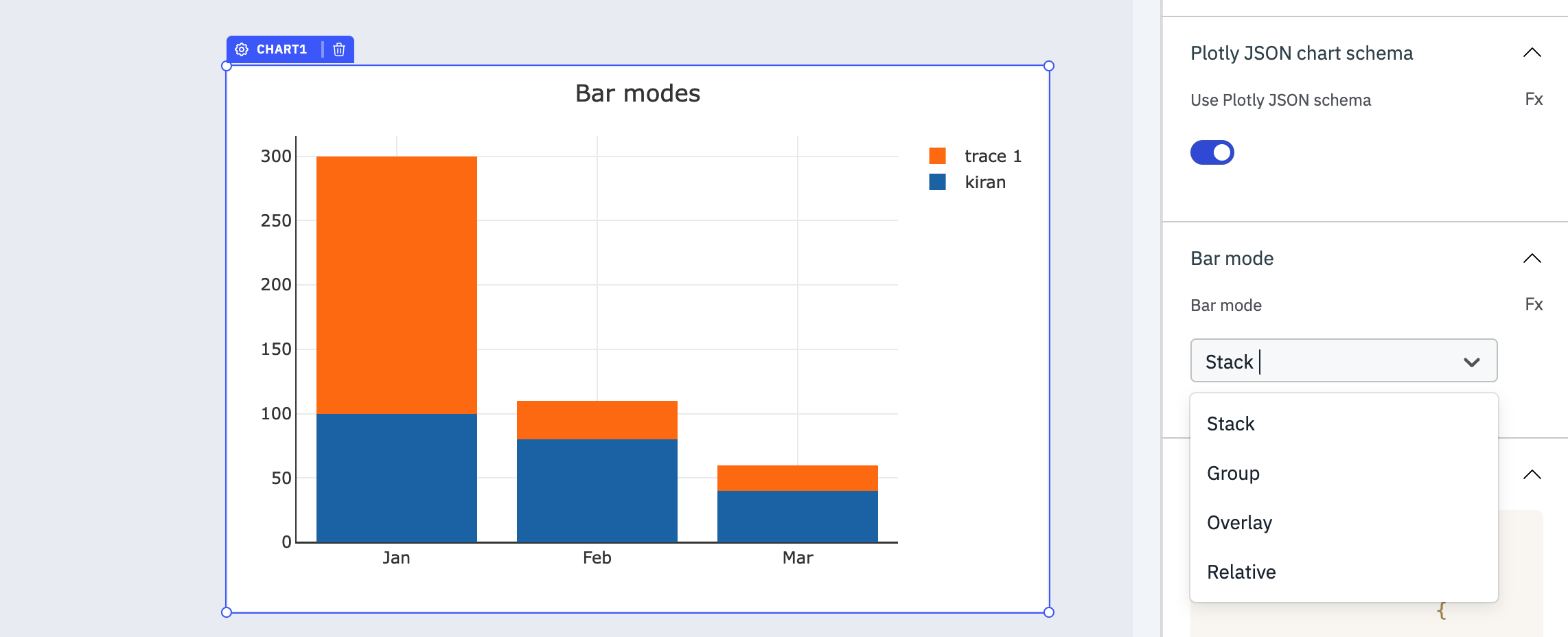
Bar Mode
The Bar Mode option allows you to customize the layout and display style specifically for bar charts. This option becomes available when the Plotly JSON chart schema toggle is enabled and a JSON schema specific to bar charts is provided. This option provide different modes for organizing and presenting bars within the chart.
Please note that the Bar Mode option only affects the layout of bar charts, and it requires a JSON schema specifically designed for bar charts. It cannot be used to modify the layout of other chart types such as line charts or pie charts.
It offers four different modes:
1. Stack Mode: Bars are stacked on top of each other, displaying the total value of each category as well as the individual values within the stack.
2. Group Mode: Bars of different categories are grouped together side by side, facilitating direct comparison between the groups and their subcategories.
3. Overlay Mode: Bars from different categories overlap with slight offsets, allowing for detailed visual comparison of individual values across categories.
4. Relative Mode: Bars represent proportions or percentages relative to a reference value, emphasizing the relative significance of each category.
Examples of Plotly JSON chart schema
In the JSON description, the value needs to be the data array with x and y axis values and at the end we need to specify the type. let's take a look at the examples for different chart types.
Line
Displays trends and patterns in data over time.
{
    "data": [
        {
            "x": ["Jan", "Feb", "Mar"],
            "y": [100, 80, 40],
            "type": "line"
        },
        {
            "x": ["Jan", "Feb", "Mar"],
            "y": [300, 30, 20],
            "type": "line"
        }
    ]
}

Line Chart With Annotations
Displays trends and patterns in data over time with annotations.
{
  "data": [
    {
      "x": ["Jan", "Feb", "Mar"],
      "y": [100, 80, 40],
      "type": "scatter",
      "mode": "lines+markers"
    }
  ],
  "layout": {
    "title": "Monthly Performance",
    "annotations": [
      {
        "x": "Jan",
        "y": 100,
        "xref": "x",
        "yref": "y",
        "text": "January: 100",
        "showarrow": true,
        "arrowhead": 2,
        "ax": 0,
        "ay": -30
      },
      {
        "x": "Feb",
        "y": 80,
        "xref": "x",
        "yref": "y",
        "text": "February: 80",
        "showarrow": true,
        "arrowhead": 2,
        "ax": 0,
        "ay": -30
      },
      {
        "x": "Mar",
        "y": 40,
        "xref": "x",
        "yref": "y",
        "text": "March: 40",
        "showarrow": true,
        "arrowhead": 2,
        "ax": 0,
        "ay": -30
      }
    ]
  }
}

Bar
Compares categories of data or visualizes changes in a variable across different groups.
{
    "data": [
        {
            "name": "SF Zoo",
            "type": "bar",
            "x": [20, 14, 23],
            "y": ["giraffes", "orangutans", "monkeys"],
            "marker": {
                "line": {
                    "color": "rgba(55, 128, 191, 1.0)",
                    "width": 1
                },
                "color": "rgba(55, 128, 191, 0.6)"
            },
            "orientation": "h"
        },
        {
            "name": "LA Zoo",
            "type": "bar",
            "x": [12, 18, 29],
            "y": ["giraffes", "orangutans", "monkeys"],
            "marker": {
                "line": {
                    "color": "rgba(255, 153, 51, 1.0)",
                    "width": 1
                },
                "color": "rgba(255, 153, 51, 0.6)"
            },
            "orientation": "h"
        }
    ],
    "layout": {
        "barmode": "stack"
    }
}

Candlestick
Analyzes the price movement of financial instruments (stocks, currencies, etc.) over a specific time frame.
{
  "data": [
    {
      "x": ["2024-04-02", "2024-04-03", "2024-04-04"],
      "close": [120, 125, 130],
      "high": [125, 130, 135],
      "low": [115, 120, 125],
      "open": [115, 120, 125],
      "type": "candlestick"
    }
  ]
}

Contour
Typically used to represent three-dimensional data in two dimensions using contour lines.
{
  "data": [
    {
      "x": [1, 2, 3, 4],
      "y": [1, 2, 3, 4],
      "z": [[1, 2, 3, 4], [2, 3, 4, 5], [3, 4, 5, 6], [4, 5, 6, 7]],
      "type": "contour"
    }
  ]
}

Heatmap
Reveals the density or magnitude of data points across two dimensions, using color to represent intensity.
{
    "data": [
        {
            "z": [[1, 20, 30], [20, 1, 60], [30, 60, 1]],
            "x": ["Experiment 1", "Experiment 2", "Experiment 3"],
            "y": ["Trial 1", "Trial 2", "Trial 3"],
            "type": "heatmap"
        }
    ]
}

Icicle
Displays hierarchical data in a nested structure, ideal for understanding the relative sizes of parts within a whole.
{
    "data": [
        {
            "labels": ["A", "B", "C", "D", "E", "F"],
            "parents": ["", "A", "A", "B", "B", "B"],
            "type": "icicle"
        }
    ]
}

3D Mesh
Represents three-dimensional surfaces, often used in scientific or engineering data visualization.
{
    "data": [
        {
            "x": [0, 1, 2, 0],
            "y": [0, 0, 1, 2],
            "z": [0, 2, 0, 1],
            "alphahull": 5,
            "type": "mesh3d"
        }
    ]
}

Check the Plotly documentation to explore the all type of charts available.