Chart
The Chart component allows you to visualize your data. In this document, we'll go through all the configuration options for the Chart component.
Title
Under the Title property, you can enter a title that displays at the top of the chart component.
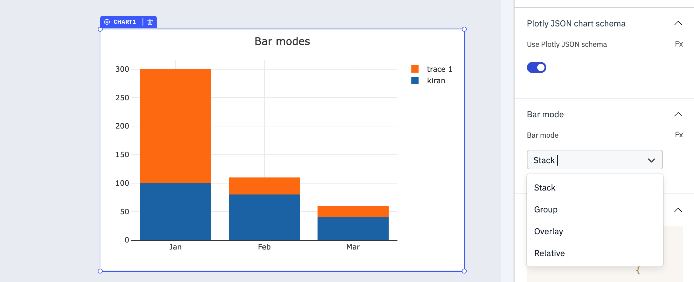
Plotly JSON Chart Schema
You can use the toggle to enable or disable Use Ploty JSON Schema. Additional, you can enable or disable it dynamically configure the value by clicking on fx and entering a logical expression.
Properties
Property | Description |
|---|---|
| Chart type | You can select the type from the dropdown options or dynamically configure the value by clicking on fx and entering a logical expression that returns line, pie or bar. |
Events
Event | Description |
|---|---|
| On data point click | Triggers whenever the user clicks on data points. |
| On double click | Triggers whenever the user double clicks on the chart area. |
Check Action Reference docs to get detailed information about all the Actions.
Component Specific Actions (CSA)
There are currently no CSA (Component-Specific Actions) implemented to regulate or control the component.
Exposed Variables
| Variable | Description | How To Access |
|---|---|---|
| chartTitle | Holds the title of the chart component. | Accessible dynamically with JS (for e.g., {{components.chart1.chartTitle}}). |
| xAxisTitle | Contains the title for the X-axis of the chart. | Accessible dynamically with JS (for e.g., {{components.chart1.xAxisTitle}}). |
| yAxisTitle | Contains the title for the Y-axis of the chart. | Accessible dynamically with JS (for e.g., {{components.chart1.yAxisTitle}}). |
| clickedDataPoints | Stores details about the data points that were clicked. | Accessible dynamically with JS (for e.g., {{components.chart1.clickedDataPoints}}). Each data point includes xAxisLabel, yAxisLabel, dataLabel, dataValue, and dataPercent. |
Chart data
The data needs to be in JSON format and should have x and y keys. The component supports string and object JSON data types.
Example:
[
  { "x": "Jan", "y": 100},
  { "x": "Feb", "y": 80},
  { "x": "Mar", "y": 40},
  { "x": "Apr", "y": 100},
  { "x": "May", "y": 80},
  { "x": "Jun", "y": 40}
]
Marker Color
Available for line and bar charts, Marker Color defines the color of the line or bars on the chart.
Options
Option | Description | Configuration Options |
|---|---|---|
| Loading state | Enables a loading spinner, often used with isLoading to indicate progress. Toggle or set dynamically. | Enable/disable the toggle button or dynamically configure the value by clicking on fx and entering a logical expression. |
| Show axis | Hides or displays the axes on the chart. | Enable/disable the toggle button or dynamically configure the value by clicking on fx and entering a logical expression. |
| Show grid lines | Hides or displays the grid lines on the chart. | Enable/disable the toggle button or dynamically configure the value by clicking on fx and entering a logical expression. |
Devices
Device | Description |
|---|---|
| Show on desktop | Makes the component visible in desktop view. You can set it with the toggle button or dynamically configure the value by clicking on fx and entering a logical expression. |
| Show on mobile | Makes the component visible in mobile view. You can set it with the toggle button or dynamically configure the value by clicking on fx and entering a logical expression. |
Plotly Configuration
You can refer to the Ploty's documentation for information on Ploty's JSON Chart Schema.
Bar Mode
The Bar Mode option allows you to customize the layout and display style specifically for bar charts. This option becomes available when the Plotly JSON chart schema toggle is enabled and a JSON schema specific to bar charts is provided. This option provide different modes for organizing and presenting bars within the chart.
Please note that the Bar Mode option only affects the layout of bar charts, and it requires a JSON schema specifically designed for bar charts. It cannot be used to modify the layout of other chart types such as line charts or pie charts.
It offers four different modes:
1. Stack Mode: Bars are stacked on top of each other, displaying the total value of each category as well as the individual values within the stack.
2. Group Mode: Bars of different categories are grouped together side by side, facilitating direct comparison between the groups and their subcategories.
3. Overlay Mode: Bars from different categories overlap with slight offsets, allowing for detailed visual comparison of individual values across categories.
4. Relative Mode: Bars represent proportions or percentages relative to a reference value, emphasizing the relative significance of each category.
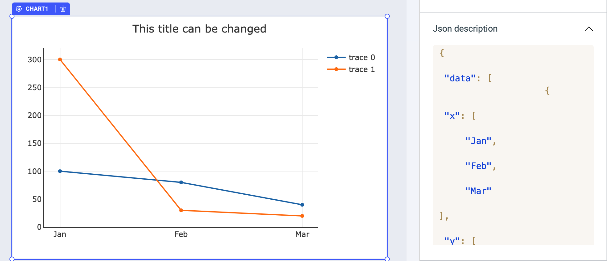
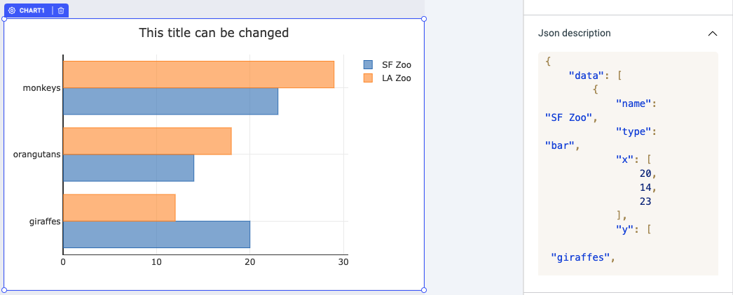
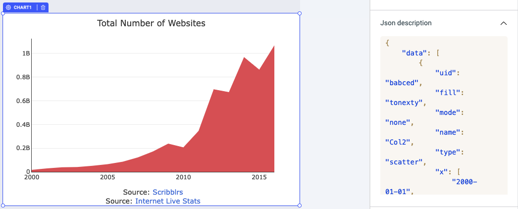
Examples of Plotly JSON chart schema
In the JSON description, the value needs to be the data array with x and y axis values and at the end we need to specify the type. let's take a look at the examples for different chart types.
Line
  {
    "data": [
        {
            "x": [
                "Jan",
                "Feb",
                "Mar"
            ],
            "y": [
                100,
                80,
                40
            ],
            "type": "line"
        },
        {
            "x": [
                "Jan",
                "Feb",
                "Mar"
            ],
            "y": [
                300,
                30,
                20
            ],
            "type": "line"
        }
    ]
}
Bar
{
    "data": [
        {
            "name": "SF Zoo",
            "type": "bar",
            "x": [
                20,
                14,
                23
            ],
            "y": [
                "giraffes",
                "orangutans",
                "monkeys"
            ],
            "marker": {
                "line": {
                    "color": "rgba(55, 128, 191, 1.0)",
                    "width": 1
                },
                "color": "rgba(55, 128, 191, 0.6)"
            },
            "orientation": "h"
        },
        {
            "name": "LA Zoo",
            "type": "bar",
            "x": [
                12,
                18,
                29
            ],
            "y": [
                "giraffes",
                "orangutans",
                "monkeys"
            ],
            "marker": {
                "line": {
                    "color": "rgba(255, 153, 51, 1.0)",
                    "width": 1
                },
                "color": "rgba(255, 153, 51, 0.6)"
            },
            "orientation": "h"
        }
    ],
    "layout": {
        "barmode": "stack"
    },
    "frames": []
}
Area
{
    "data": [
        {
            "uid": "babced",
            "fill": "tonexty",
            "mode": "none",
            "name": "Col2",
            "type": "scatter",
            "x": [
                "2000-01-01",
                "2001-01-01",
                "2002-01-01",
                "2003-01-01",
                "2004-01-01",
                "2005-01-01",
                "2006-01-01",
                "2007-01-01",
                "2008-01-01",
                "2009-01-01",
                "2010-01-01",
                "2011-01-01",
                "2012-01-01",
                "2013-01-01",
                "2014-01-01",
                "2015-01-01",
                "2016-01-01"
            ],
            "y": [
                "17087182",
                "29354370",
                "38760373",
                "40912332",
                "51611646",
                "64780617",
                "85507314",
                "121892559",
                "172338726",
                "238027855",
                "206956723",
                "346004403",
                "697089489",
                "672985183",
                "968882453",
                "863105652",
                "1068513050"
            ],
            "fillcolor": "rgb(224, 102, 102)"
        }
    ],
    "layout": {
        "title": "Total Number of Websites",
        "width": 800,
        "xaxis": {
            "type": "date",
            "range": [
                946702800000,
                1451624400000
            ],
            "title": "Source: <a href=\"http://www.scribblrs.com/\">Scribblrs</a><br>Source: <a href=\"http://www.internetlivestats.com/total-number-of-websites/\">Internet Live Stats</a>",
            "showgrid": false,
            "autorange": true,
            "tickformat": "%Y"
        },
        "yaxis": {
            "type": "linear",
            "range": [
                0,
                1124750578.9473684
            ],
            "title": "",
            "autorange": true
        },
        "height": 500,
        "autosize": false
    },
    "frames": []
}
Check the Plotly documentation to explore the all type of charts available.
Styles
Field Property | Description | Configuration Options |
|---|---|---|
| Background color | Sets the background color of the component. | Select the color or click on fx and input code that programmatically returns a Hex color code. |
| Paddings | Sets the padding of the component. | Enter a numeric value. (for e.g., 22) |
| Border radius | Modifies the border radius of the component. | Enter a number or click on fx and enter a code that programmatically returns a numeric value. |
| Visibility | Sets the visibility of the component. | Enable/disable using the toggle button or dynamically configure the value by clicking on fx and entering a logical expression. |
| Disables | Allows you to enable/disable a component. The component is not interactive when it is disabled. | Enable/disable using the toggle button or dynamically configure the value by clicking on fx and entering a logical expression. |