Button
Button component can be used to trigger an action. It can be used to submit a form, navigate to another page, or trigger a query.
Properties
Property | Description | Expected Value |
|---|---|---|
| Button text | Used to set the label of the button. | Any String value: Send Message, Delete, or {{queries.xyz.data.action}} |
| Loading state | The loading state is used to show a spinner as the button content. Loading state is commonly used with isLoading property of the queries to show a loading status while a query is being run. | Toggle the switch On or click on fx to programmatically set the value to {{true}} or {{false}} |
Events
Events are actions that can be triggered programmatically when the user interacts with the component. Click on the component handle to open its properties on the right. Go to the Events accordion and click on + Add handler.
Event | Description |
|---|---|
| On click | The On click event is triggered when the button is clicked. |
| On hover | The On hover event is triggered when the mouse cursor is moved over the button. Just like any other event on ToolJet, you can set multiple handlers for on click event. |
Check Action Reference docs to get the detailed information about all the Actions.
Component Specific Actions (CSA)
Following actions of Button component can be controlled using the component specific actions(CSA):
Actions | Description | How To Access |
|---|---|---|
| click | Regulate the click of a button via a component-specific action within any event handler. | Employ a RunJS query to execute component-specific actions such as await components.button1.click() |
| setText | Control the button's text using component specific action from any of the event handler. You can also | Use RunJS query to execute component specific actions: await components.button1.setText('New Button Text') |
| disable | Disable the button using the component specific action from any of the event handler. You can also | Use RunJS query to execute this action: await components.button1.disable(true) or await components.button1.disable(false) |
| visibility | Hide the button using the component specific action from any of the event handler. You can also | Use RunJS query to execute this action: await components.button1.visibility(true) or await components.button1.visibility(false) |
| loading | Sets the loading state of the button dynamically using the component specific actions from any of the event handler. | Use this action from RunJS: await components.button1.loading(true) or await components.button1.loading(false) |
Exposed Variables
Variable | Description | How To Access |
|---|---|---|
| buttonText | This variable stores the text displayed on the button. | Access the value dynamically through JavaScript using the following syntax: {{components.button1.buttonText}} |
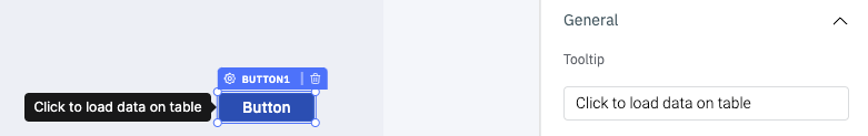
General
Tooltip
A Tooltip is often used to display additional information when the user hovers the mouse pointer over the component. Once a value is set for Tooltip, hovering over the element will display the specified string as the tooltip text.
Layout
Layout | Description |
|---|---|
| Desktop | Toggle to show or hide the component in the desktop view. Dynamically configure the value by clicking on Fx and entering a logical expression that results in either true or false. Alternatively, the values can be set to {{true}} or {{false}}. |
| Mobile | Toggle to show or hide the component in the desktop view. Dynamically configure the value by clicking on Fx and entering a logical expression that results in either true or false. Alternatively, the values can be set to {{true}} or {{false}}. |
Styles
Style | Description | Expected Value |
|---|---|---|
| Background color | Change the background color. | Choose color from the colorpicker or enter the Hex color code. ex: #000000 |
| Text color | Change the text color. | Choose color from the colorpicker or enter the Hex color code. ex: #000000 |
| Loader color | Change the color of the loader (if loading state is enabled) | Choose color from the colorpicker or enter the Hex color code. ex: #000000 |
| Visibility | Make the component visible or hidden. | {{true}} or {{false}}, By default, its value is set to {{true}} |
| Disable | Disable the button. | {{true}} or {{false}}, By default, its value is set to {{false}} |
| Border radius | Add a border radius to the button using this property. | Any numerical value from 0 to 100 |
| Border color | Change the border color of the button. | Choose color from the colorpicker or enter the Hex color code. ex: #000000 |
| Box Shadow | Sets the add shadow effects around a component's frame. You can specify the horizontal and vertical offsets(through X and Y sliders), blur and spread radius, and color of the shadow. | Values that represent X, Y, blur, spread, and color. Example: `9px 11px 5px 5px #00000040`` |